ION
2026
Making investing discoverable for retail banking customers
Designed a modern investment experience for ION’s Core Banking division, turning a buried legacy feature into a more discoverable retail journey with the essential tools investors expect.

TLDR
What
ION is a B2B fintech that builds complex financial software across trading, data, and banking. For its Core Banking division, the opportunity was to create a modern investment experience for Italian retail investors.
Why
Investing already existed within ION’s legacy home-banking app, but it was hard to find and too limited to compete with the brokerage experiences customers had come to expect. The project focused on making investing visible, understandable, and useful from the first interaction.
Who
The target was a non-professional Italian retail investor (35+) who invests occasionally through their bank. They are comfortable using mobile apps, want the experience to feel clear, safe, and reliable, and may range from first-time investors to people with an existing portfolio. We intentionally did not design exclusively for either advanced traders or complete beginners.
Impact
The project gave ION its first real footing in retail—across B2C and B2B2C—helped secure its first bank client, and opened several ongoing conversations.
Long term, it creates a new investment experience for ION’s existing home-banking users: a new app and a feature finally out in the open.
Solution
Clarity-first investing experience
The module is organised into a small set of end-to-end flows, each designed to keep investing clear, safe, and accessible.
Home — glanceable performance + entry points. "How am I doing?" answered in one look

Search vs. Discover — two different moods, kept deliberately apart. Search is for when you already know what you want — quick, in and out. Discover is for browsing, and because we have six asset types, it's filtered so you're not drowning in everything at once
Asset Detail Page — for the user to make an informed decision. It sits at the center of every journey, so I built the product outward from here
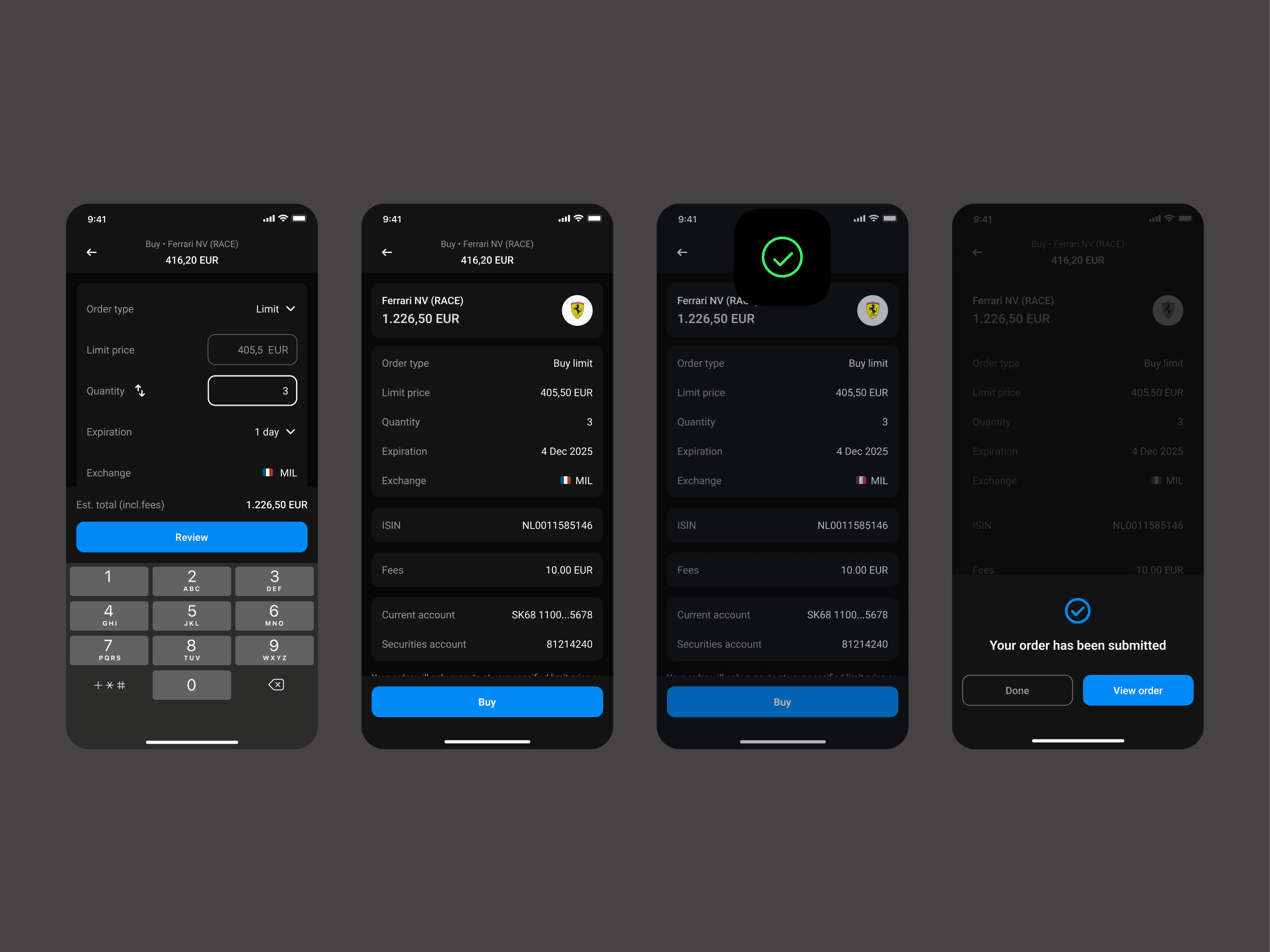
Order flow (buy/sell) — a guided, forgiving flow. Clear primary action, unmissable errors

All error states for order flow

Portfolio — holdings, performance, allocations, orders and transactions
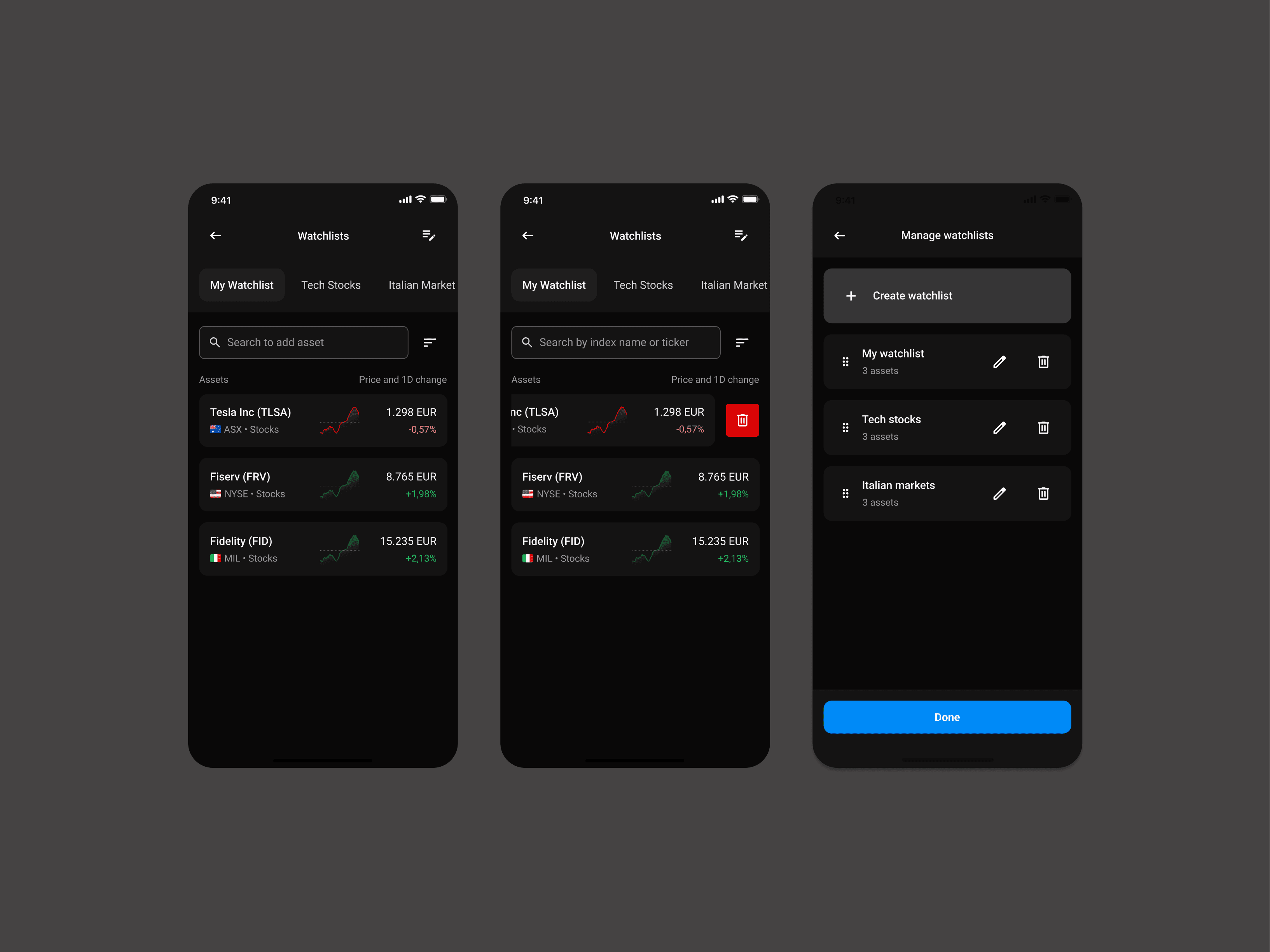
Watchlists — multiple lists, with adding to a list and creating a new list handled on the same screen
A few principles I kept coming back to:
Only show what a passive investor actually needs. On the asset detail page especially, I resisted the urge to dump every stat you'd find on a finance website. Complicated information could overwhelm the user, instead we only went with five key stats to start from.
Make the risky moments loud. In the order flow, errors are impossible to miss. If something's wrong, you'll know before you commit.
Feel like the apps people already trust. We were consciously measuring ourselves against competitors like Revolut, HSBC, ING etc. to establish familiarity and gain user trust.
Accessibility from the first pixel, not bolted on later.
Problem
How it all started?
ION is a strong B2B company. It builds serious financial software, mostly for other businesses. What it didn't have was a retail face, and it certainly didn't have a retail investment product.
The push came from core banking: a need for a "best in class trading tool". We already had investing inside an older home-banking app, except it was buried so deep that most of the roughly 1.8 million people using that app didn't know it existed and it missed on some major workflows.
So there were two problems stacked together. As a company, we had nothing retail to show a client. As a product, we were hiding a feature that had a customer base of around 1.2M users
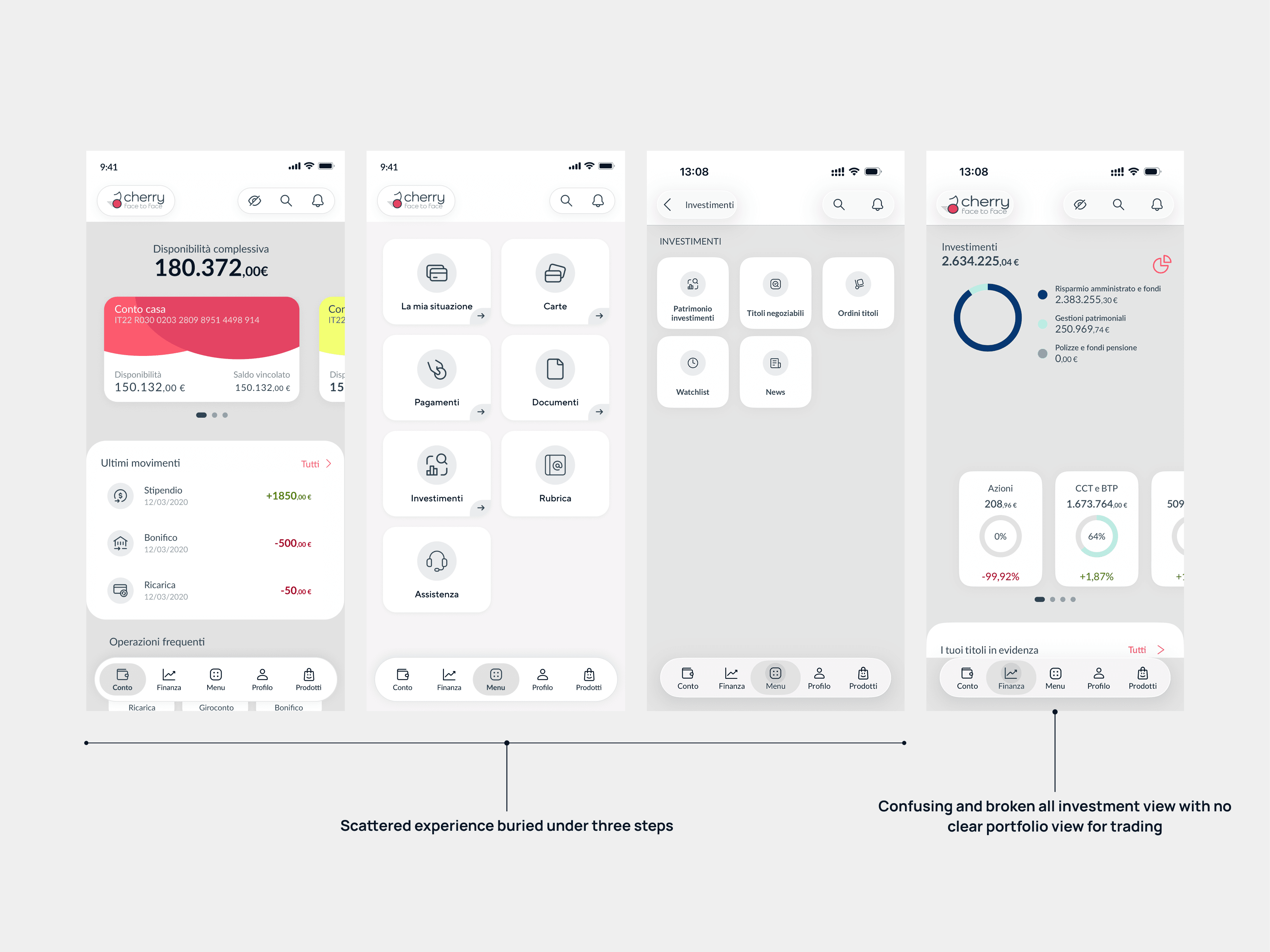
Old, buried investment feature
Defining best in class
To converge on the product plan we began with feature scoping and asking ourselves "what is best in class?" We did a wide scale competitor analysis ranging from heavy trading tools to simpler flows like Trade Republic and its peer, eventually defining that we wanted a simpler investment experience.

We decided to go with an app first approach to align with a the market and compete with broker apps and apps from neobanks.
Research
Investigating the problem
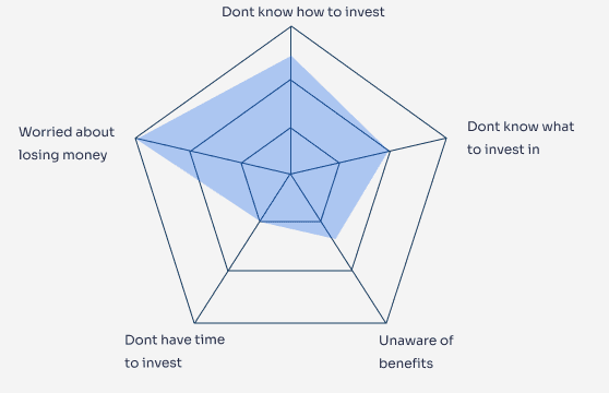
One of the main problems that the B2B sector provides is lack of access to the user base. Good thing for us we were not building something very niche. Looking at all the pre- existing research in the market + our competitor analysis, we came across one fact that investing is still not common in Italy.

According to BlackRock’s October 2024 survey, only 29% of Italian adults invest—one of the lowest percentages in Western Europe, ahead of only Spain and Portugal, where the figure is 28%. In sync with the trend this area provided a huge untapped market for us to build upon.
Trading view article on Italian markets
We recognised a deep hidden market here and wanted to further research into investment habits to build something robust but we had one big restriction: MVP deadline
So we decided to run an internal survey in Italian offices and further boil down the results to conduct 10 exploratory interviews and task based user testing. The survey was not only a screener but also asked data like "what kind of products do users invest in?" or "what apps do they use?"
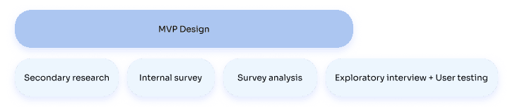
In the absence of an actual client we had a vague sense of the actual user. All we knew was that they will be the bank clients and reading about Italy's investor metrics not very heavy on trading. Hence we decided to build for everyone in MVP and later mold the app to fit to different personas. This was done through:
Curiosity
I love questioning things and finding new ways to innovate, always driven by curiosity.
Limitations
What was not in our favour
Integration uncertainty
For a long stretch we were designing without knowing how the module would actually be embedded, possibly inside someone else's app, possibly in an iFrame, white labelled and with the navigation of the host app.
This uncertainty led to making defensive choices rather than ideal, working on scalable system and avoiding putting functions in header and footer of the app.

Different integration possibilites
An enterprise design system doing a retail job
The biggest one. The system was built for complex B2B web software, and we had to make it feel like a clean consumer app.
Managing global markets
The app allowed trading on exchanges worldwide and that consideration widened a whole new layer of possibilities and complexity
Accessibility
Building accessibly from day 1
Accessibility was a pillar of this project, and a big part of my role.
The European Accessibility Act came into force in June 2025, which meant TOL had to meet WCAG 2.2 AA. We had no accessibility champion on the team and nothing comparable inside the company to learn from, so I led it from scratch.
In practice that meant designing with screen readers in mind from the first screen rather than retrofitting: proper semantics, sensible focus order, real labels. Touch targets, spacing, and contrast became non-negotiable baselines. And I spent real time running screen readers, writing accessibility annotations, and going back through the criteria looking for gaps.
Meeting WCAG 2.2 AA wasn't only compliance for us. It became something we could put on the table as a genuine differentiator.


AI
When in doubt, ask Claude
I used AI as a partner throughout, for breadth and first drafts, never as the final word.
Competitor analysis. Finding those buried bank screens is where it first earned its place, surfacing references far faster than hunting manually.
Learning the domain and market. Building up a picture of investing and of European investor behaviour, always checked against the PMs before it shaped anything.
Architecture drafts. I used Claude and ChatGPT to spin up rough first-pass structures for how to nest and organize the module, then pulled them apart and rebuilt around the user's mental model.
Flow exploration in Figma Make. For the multiple-watchlist enhancement, I fed it my existing single-watchlist screens and asked it to extend them as it saw fit against the requirements. It was quick for generating explorations to react to.
The rule throughout: every market insight got validated by a PM, every generated architecture or flow was a starting point I reshaped, and nothing was shipped as-is.

Iterations
Infinite feedback loop
Almost nothing here was first-try. The pattern was consistent: generate a pile of options, weigh the pros and cons myself, take them to PMs, devs, and other designers for feedback, argue it out, then commit at a checkpoint and move on. You can't hold a decision forever.
The asset detail page. We went round and round on which key stats to show and when, and how to handle someone with no investments yet. Keeping orders and transactions distinct, and stopping buy, sell, dividend, and tax from blurring together, took real work.

[Media: ADP V1 → V2 → V3]
Buy and sell. Two or three visual directions. One put a huge number in the center so the amount you're entering is the whole focus. The other gave order type, exchange, and amount more equal weight. We chose the balanced one — it scaled better for the extra fields we'd need, and it felt fairer to the user. Hiding options just to look sleek isn't actually doing them a favor.

[Media: before/after of the two directions]
The portfolio. The richest problem. Allocations by asset type, currency, asset class, and country, each with its own edge. Our base currency is Euros, so how do you show a stock bought in USD? If an Asia-domiciled fund holds mostly European companies, is that allocation Asia or Europe, and what does the API even return? Do orders and transactions both belong here, and which leads? Where do recurring investments live, when you can cancel an order but can't "sell" a recurring plan? Each was its own conversation.

[Media: portfolio allocation iterations]
Watchlists. Supporting several lists, plus adding and creating, without cluttering a single screen.

The winning option usually won for the same reasons: it scaled better, it was easier to integrate, or it simply matched how a user would expect things to work.
Lessons
All my learnings throughout the project
Start with questions, not wireframes
The hardest lesson from early on: building on top of an unresolved question just makes the question harder to see. Going into a meeting with clarity on what you don't know yet is more valuable than going in with screens built on shaky ground. I learned this the hard way on the first asset class and applied it to every one after.
Try the approach before ruling it out
We almost dismissed the big-number layout in conversation before building it. When we actually put our fields into it, we saw immediately why it didn't work — and that clarity was faster and cleaner than any discussion would have been. Prototyping a wrong answer teaches you something. Debating whether it's wrong doesn't.
Imperfect testing beats no testing
We couldn't get Italian users. We tested with seven people in the office. That testing still caught the missing confirmation step — a real issue that desk research wouldn't have surfaced. The sample wasn't perfect. It didn't need to be. Just be honest about what it can and can't tell you, and act on what it does.
